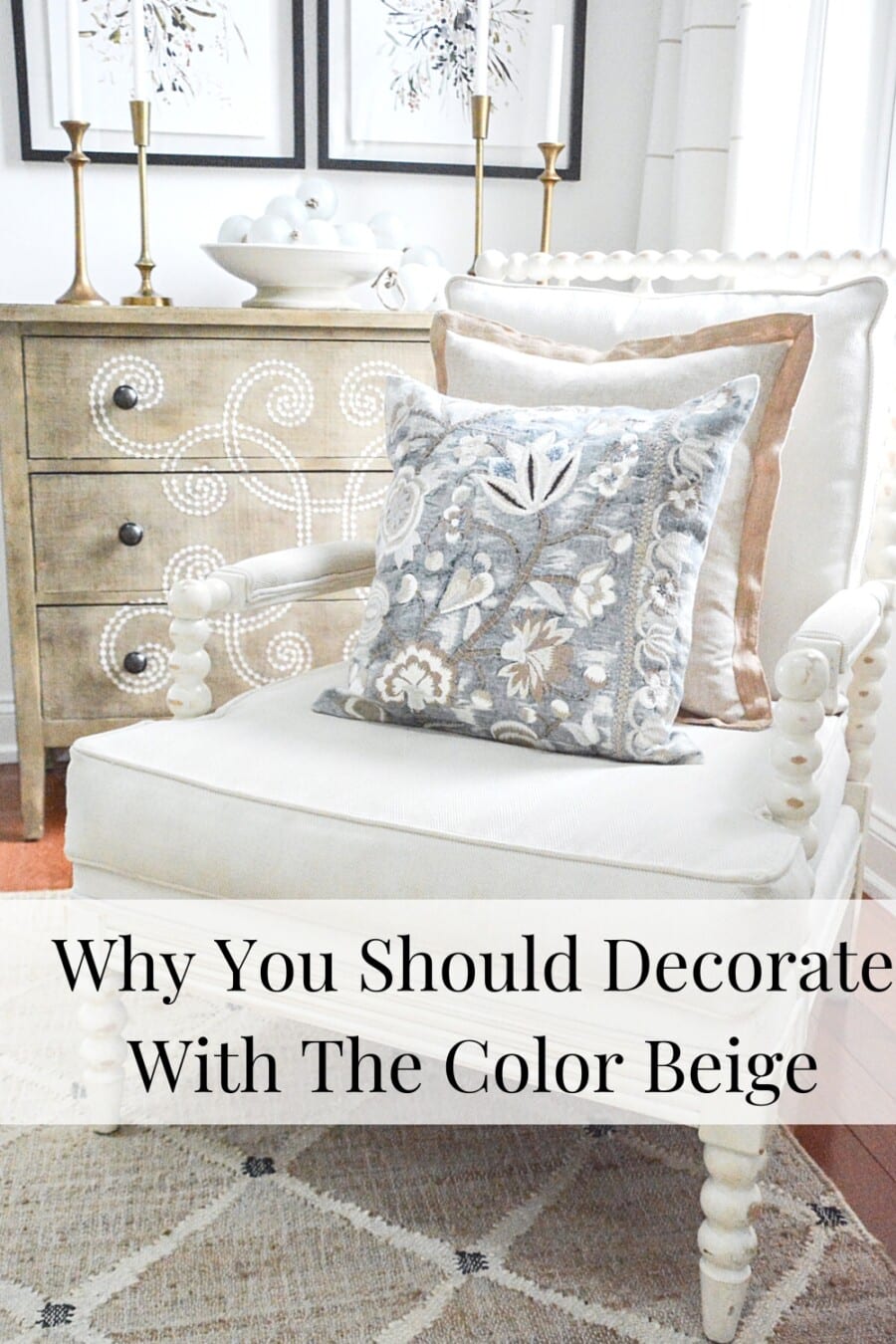
Understanding And Decorting With The Color Beige
The color beige is beautiful and complex. It is also one of the most versatile colors, playing beautifully with almost any color scheme. It’s restful, sophisticated, and friendly and can work in any room! Discover why you should think about decorating with the color beige in your home.
The color beige often gets a bad rap and is so undeserved! Beige, along with a warm color scheme, is the latest trend in interior design. After a decade dominated by gray tones, beige is making a strong comeback, and rightfully so. Decorating with beige is a wise decision, as it transcends trends and has remained a timeless classic for centuries. Here’s everything you need to know about incorporating this beautiful color into your decor.
Affiliate links included. See our Discloser Policy. As an Amazon Associate, I earn from qualifying purchases.
I can just hear some of you saying, “Oh, beige… boring”! But beige is not boring at all. Actually, it is quite fascinating and surprisingly complex!
What Is Beige?
A Brief History
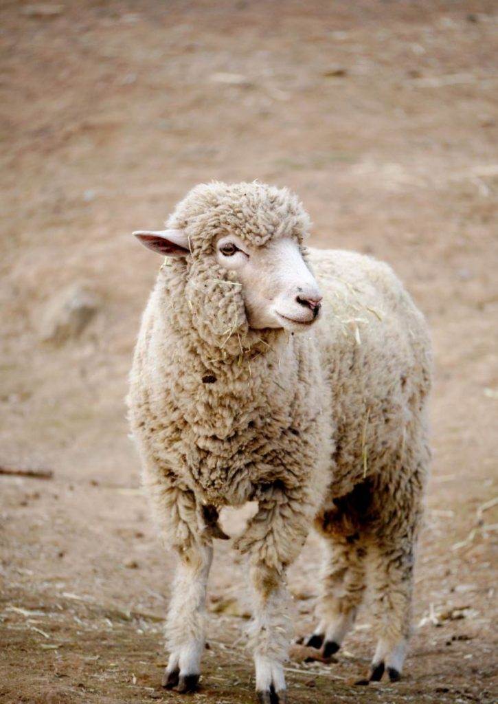
Beige is a French word meaning the color of natural wool. Not washed, bleached, or dyed, but natural wool. This makes me think of a sheep in a field. And if you have seen sheep in a field, their wool is not white or one color. It is full of color.
Look at all the different variations of beige in this fluffy sheep’s wool!
Beige has also taken on the meaning of the color of a bleached bone.
Let’s just say, for time’s sake and to have a working definition, beige is a neutral color that, in its purest form, is a light creamy off-white! It is a neutral shade in the neutral color family.
Beige is a warm, neutral color. In its purest form, beige is a light, creamy, off-white color.
French Beige
Beige probably has thousands of variations from the slightest and warmest white, cream, ecru, buff, linen, tan, cafe au lait, and khaki to the toasty, almost brown shades!
Beige is created by adding brown and white pigments together and/or the addition of gray and yellow. The result is beautiful earthy tones and shades of brown.
Brown is created by mixing the primary colors blue, yellow, and red. See where I am going with this? It’s just not that easy! Beige can be a subtle color like cream or a moodier depth of color like greige or taupe. It’s all about the other colors mixed with white and brown.
So, let’s simplify by saying basic beige is a mix of white and a touch of brown.
It’s also important to know that beige, in its most elemental form, is a warm color. We will discuss that further down in the post. But no color can be described without describing its undertone!
Undertones
Neutrals are the most complicated and complex of all colors! Beige is so nuanced, and that is what makes it so beautiful!
Remember I said that basically (and very, very basically) beige is a mixture of lots of white pigment with a bit of brown? Well, that is true, but when we talk about beige, we are probably discussing that beige is also made up of small amounts of other colors.
And these other colors have a big effect on basic beige.
The infographic I made shows you just what a small amount of another color can create when added to a basic beige.
Let’s call the top color basic beige.
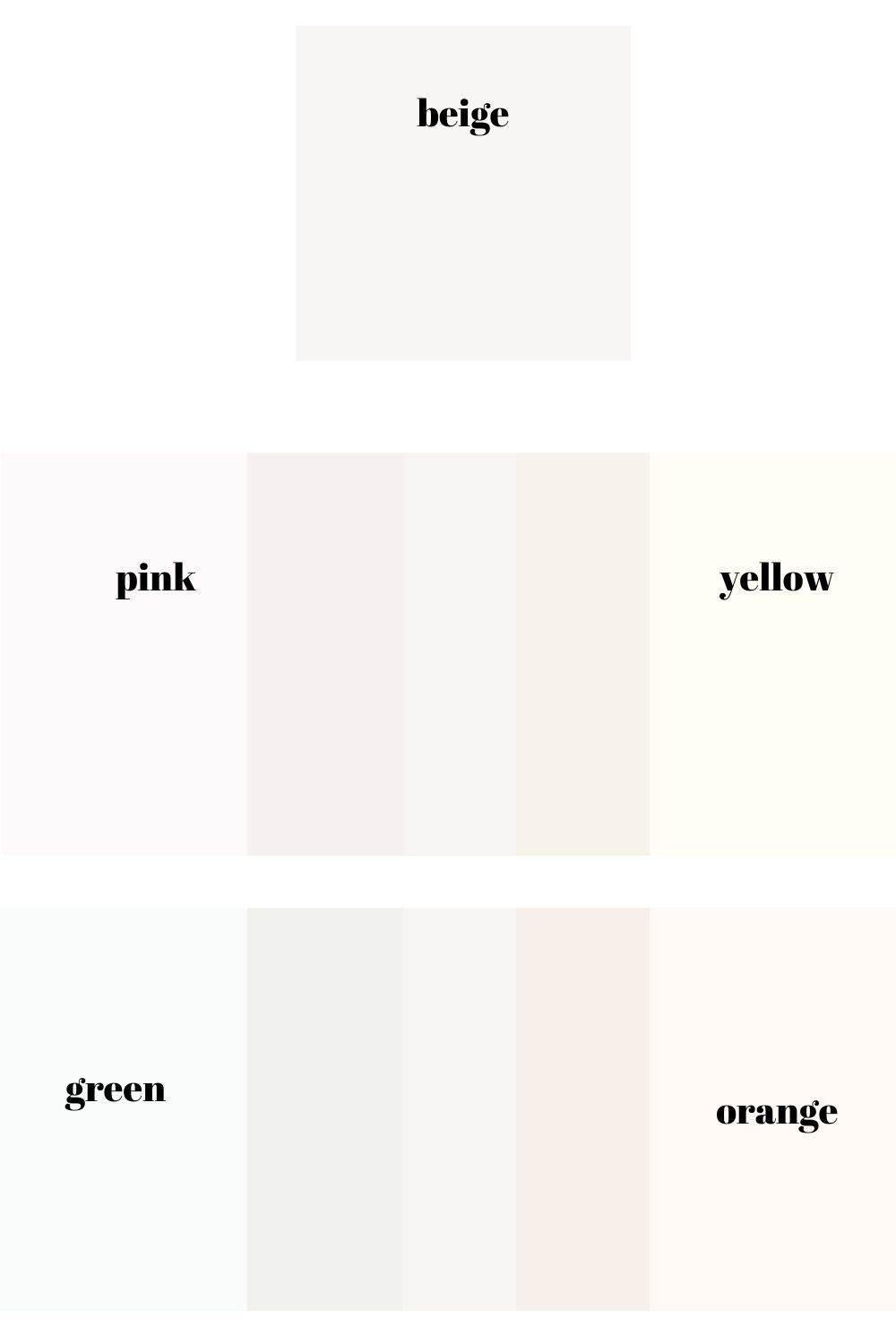
I’ve slipped just a hint of color under our basic beige, and look how that hint of color changes beige. The new colors are still beige, but they are all variations of beige.
An undertone is a color that is under or mixed into a color like beige, changing the original color.
Wondering about the importance of undertones in beige? They’re crucial! With beige, it’s never just one shade but a myriad of possibilities, all thanks to the undertones.
How Undertones Affect Beige

Knowing the undertones in a color like beige will help you know what other colors to use when decorating with your favorite beige!
Finding Undertones In Beige
Navigating undertones can feel like detective work. If you’re struggling to discern them, try placing the beige alongside a white piece of paper for comparison—the undertones might reveal themselves! And if the beige you’re working with is a paint color, you’re in luck! Many paint companies offer information on undertones and hex numbers for their paints.
Understanding the undertones in your preferred beige will give you insight into which colors will complement it best in your home!
Warm Or Cool
Not All Beiges Play Well Together
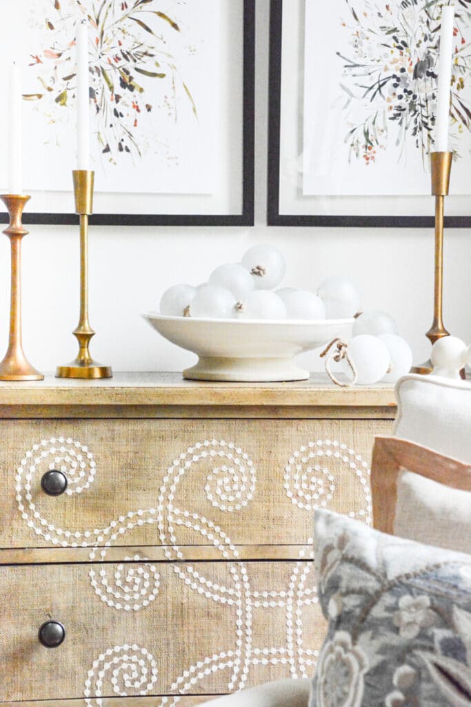
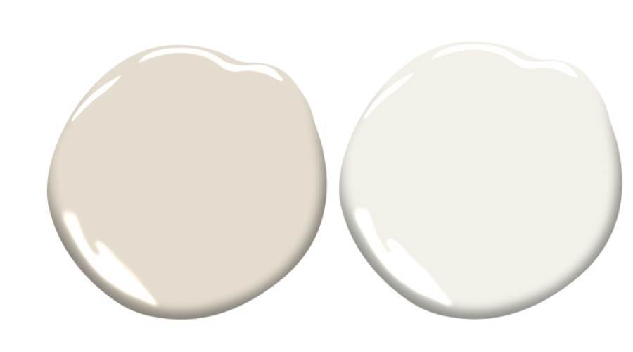
We painted the walls of our StoneGable home in my favorite beige paint color, Benjamin Moore Sonnett.
In our home, this wall color read about as beige or bone as you could get in daylight.
But here’s how it looked on the paint chip…
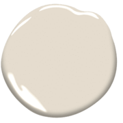
That’s why it’s crucial to paint multiple samples on your walls when considering a color, isn’t it?
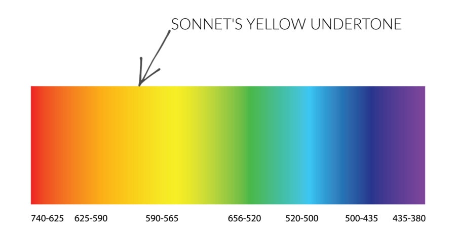
Here’s what I learned from the paint chip that I couldn’t discern from my Sonnet-painted walls: Sonnet’s beige carries a subtle yellow undertone that borders on the peach spectrum. It’s so delicate that you might even detect a hint of peach or pink in it—just a minuscule amount can alter the beige significantly!
All of the trim in our StoneGable home was painted Atrium White.
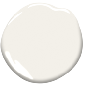
I loved Sonnet with Atrium White and no wonder! Atrium White has the tiniest undertone of pink in it, too! The undertones in the Sonnet loved playing with the undertones in Atrium White! They were happy together!
Undertones are important! They must get along with the decor of other undertones in your home. Some undertone love being together and look amazing! And some undertones fight like cats and dogs and can make a whole room look off.
Knowing undertones is essentially important for knowing what colors will and won’t work with beige. And to know with Beiges that we will work together.
Understanding undertones is crucial for determining which colors complement beige and which ones don’t. It’s essential to identify the undertones in beige to create harmony in a room.
Just think about a color combination we love from nature. Sand and sea!

Beautiful colors, right? This image has both warm and cool colors—lots of warm, darker beige!
Why do the warm sand and the cool ocean look so pretty together? Because there are a lot more warm tones in this image than cool!
Warm colors love the company of other warm colors. If you want to mix warm and cool colors together, choose 80% of one and 20 % of the other.
Warm colors bring out the best in beige!
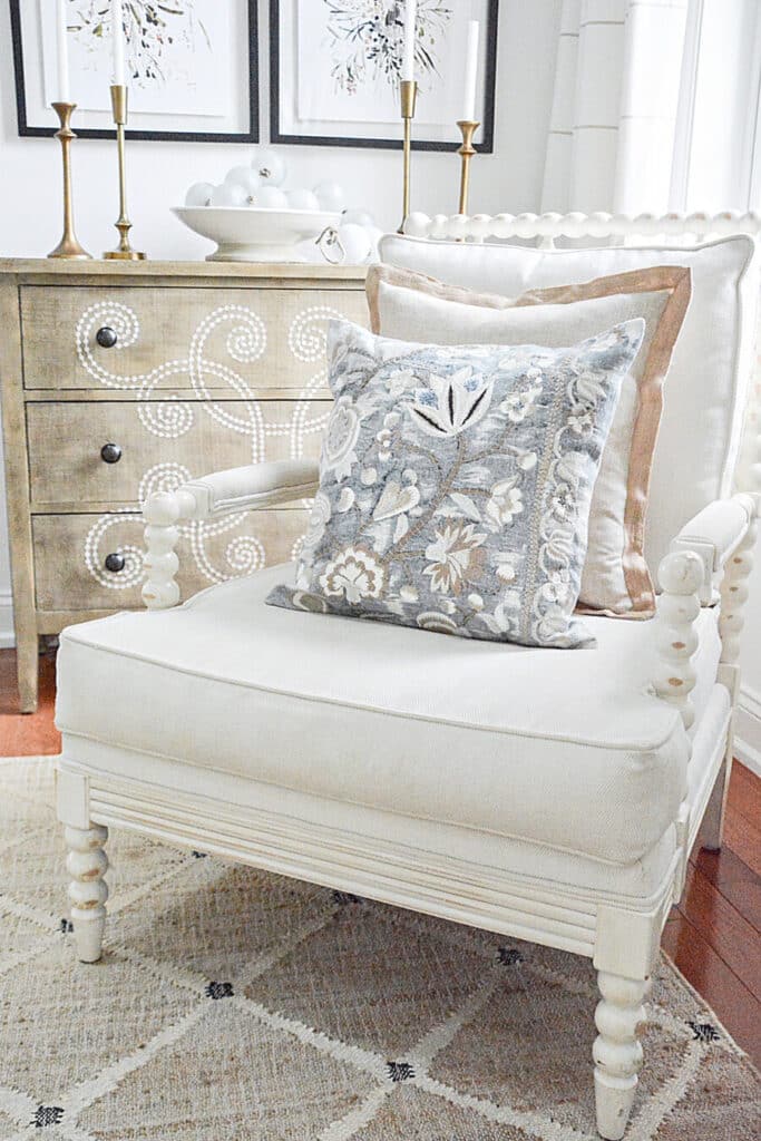
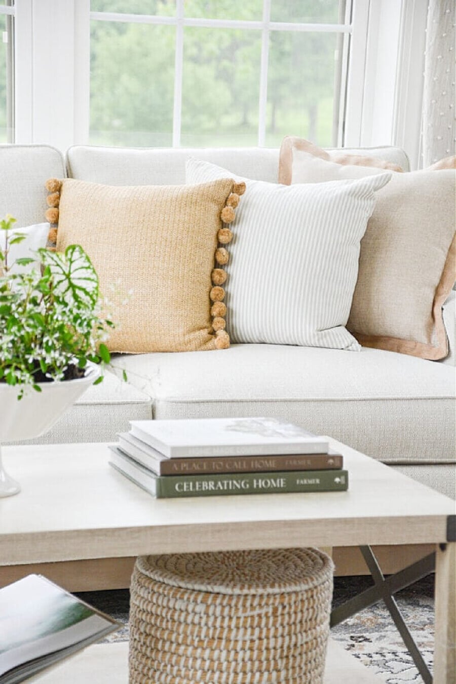
Using Contrasting Colors In A Beige Room
Adding a cool color to a room with plenty of beige is essential to prevent it from feeling dull, as a room filled with only warm or cool tones can lack visual interest.
Introduce a touch of cool color to enhance a predominantly beige space. Beige thrives with a hint of cool companionship. Follow the 80/20 rule: incorporate a small amount of warmed-up cool hues into the neutral room to bring it to life.
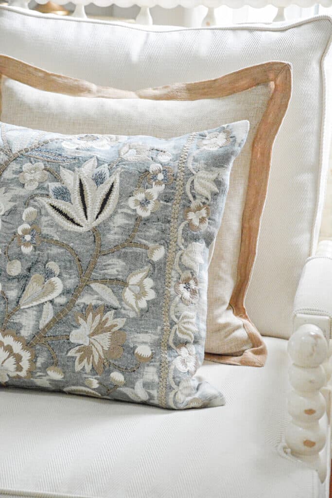
The pillow above is a blend of muddy blue, white, and beiges, fusing cool and warm hues. The blue is a distinctive muddy yet warmer shade of a cool color that works seamlessly with this room.
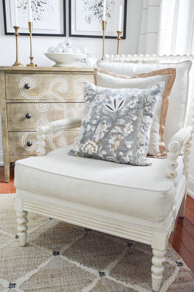
The tension of the blue color brings a bit of life and excitement to the beige room.
Adding Texture
Texture plays an important role in adding visual interest when working with a predominantly neutral color like beige. Incorporating various textures adds depth and dimension to a room and prevents it from appearing flat or monotonous.
Textures such as woven fabrics, nubby jute carpets or rugs, tactile ceramics, and natural materials like wood or stone can enrich the visual experience, creating a sense of warmth and making a room look alive.
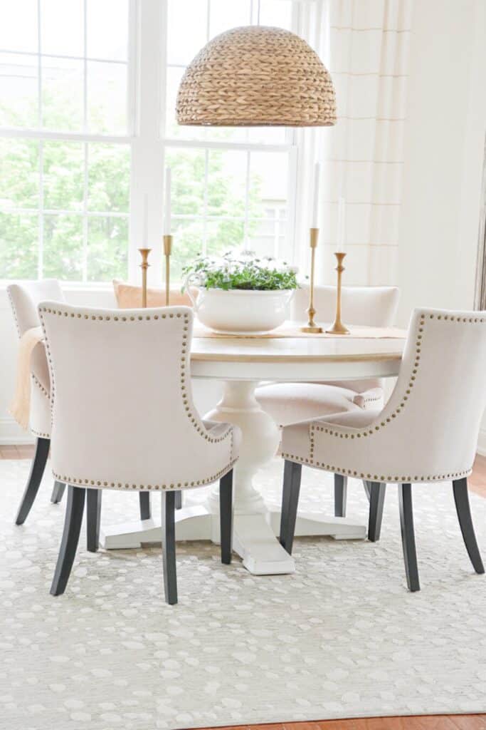
Beauty And Versatility
When it comes to timeless elegance and versatility, nothing quite matches the beauty of beige with its array of shades and tones. It brings a sense of calm and sophistication to a room. Beige is not only easy to live with but also incredibly adaptable for its ability to work with a wide range of colors and neutrals.
Despite its undeserved reputation, beige truly shines as a perfect decorating choice. Vive le beige!
FAQs About Beige
Shop Beige And White

Related Posts
CAN I MIX WARM AND COOL COLORS WHEN I DECORATE?
HOW TO MOVE TO A MORE NEUTRAL COLOR PALETTE
THE ULTIMATE GUIDE FOR CHOOSING WHITE PAINT
6 TIPS FOR CHOOSING THE PERFECT PAINT COLOR
5 BIG DECORATING MISTAKES AND HOW TO FIX THEM


Wow – what a great lesson. Thank you!
Yvonne thank you for another great post explaining color theory. It can get overwhelming sometimes without any direction. Pinning!!
Hi Yvonne,
I’ve been reading your blog for a few months now and it’s time I say thank you for all your wonderful decorating tips !! You have helped me more than you can possibly know. I also love that you live in Lancaster county. My dad grew up in Millersville and I have so many wonderful memories visiting my grandparents back in the 60’s and 70’s !! Thanks again!! Gail
This blog was a lot of work and I appreciate it. Lots of information.
This is a fantastic post!!! Thank you
This was so interesting! Thank you!
Great post!!!!!
Thank you so much for this wonderful post. I love beige and the warm neutrals and they certainly have had a bad rap. I have never loved the gray scheme; just too cold.
You explain things so well and your style is fabulous!!
Thank you.
Blessings ~
Sherrie
Thanks, Sherrie! I love beige too.
This article was very informative and gave me good tips on how I can incorporate more beige into my home.
So glad this post helped, Velia
Can you send a link for the pillow on the chair
Here you go:https://rstyle.me/+v7dR36xWYEmuJGX-CX-u_w
Love the pillow , please send a link. Thanks for this post. So much great info
Here you go:https://rstyle.me/+v7dR36xWYEmuJGX-CX-u_w
Where did you get the muddy blue textured pillow? Love your blog!
Here yo go:https://rstyle.me/+v7dR36xWYEmuJGX-CX-u_w
Do you have a link for your pillow? Please and thank you!
Here you go:https://rstyle.me/+v7dR36xWYEmuJGX-CX-u_w
Your blog speaks to me, my home is also mostly beige. I love the blue pillow you have on the chair, where did you get it?
Hi Camille, I found the pillows locally. I can’t find an online source for you.
I would love a coffee table book filled with pages of photos of your beautiful home! I would leisurely flip through those pages all day!
Aren’t you so nice!